Handling Text Different Directions
Created: 2022-10-08
Mapped Properties
It replaces physical properties (e.g width, height) with either:
- logical
- flow relative
Mapped Property for:
-
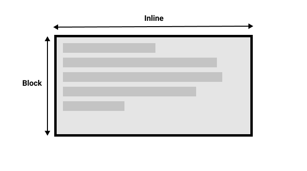
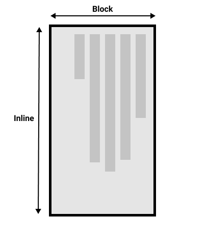
widthin a horizontal writing mode is calledinline-size—
it refers to the size in the inline dimension. -
heightis namedblock-size
refers to the block dimension.
Block dimension is always the direction blocks are displayed on the page in the writing mode in use.
Inline dimension is always the direction a sentence flows.
CSS guys don't talk about left and right
They talk about start and end
Don't worry too much about that right now, but keep these ideas in mind as you start to look at layout; you will find it really helpful in your understanding of CSS.
Physical to Logical Properties
top -> block-start
bottom -> block-end
left -> inline-start
right -> inline-end
The margin-top property is mapped to margin-block-start —
this will always refer to the margin at the start of the block dimension.
The padding-left property maps to padding-inline-start,
The padding that is applied to the start of the inline direction.
This will be where sentences start in that writing mode.
The border-bottom property maps to border-block-end,
which is the border at the end of the block dimension.
Should you use physical or logical properties?
The logical properties and values are newer than their physical equivalents,
therefore have only recently been implemented in browsers.
If you are not using multiple writing modes
then for now you might prefer to use the physical versions.
However,
ultimately we expect that people will transition to the logical versions for most things,
as they make a lot of sense once you start also dealing with layout methods such as flexbox and grid.
I think he's saying that logical properties is much better intuitively than the physical properties